Overview
A logo is a symbolic representation of a brand’s business and social identity and visually communicates a brand’s work, philosophy, and positioning in a succinct and attractive manner. This is the basis of what most people understand about logos.
Project
However, as a branding and advertising agency, we recognize a logo as a psychological play on the minds of the consumers as it subtly alters the way a brand is perceived. It is an intangible but highly valuable asset that phenomenally appreciates with time. We, at Decode Mediacom, believe that this is what a logo should aspire to be, and work towards weaving exemplary brand stories through a unique combination of typefaces, fonts, colors, and other design elements. .
A logo can potentially accomplish this by creating a solid first impression and enhancing a brand’s recall value. In addition, it helps in differentiating a business, maintaining consistency in visual communication, and fostering loyalty towards a brand.
This leads us to carefully strategize the brands and their aspirations before starting the designing process for a logo. With every color evoking a different emotion, each typeface portraying a different image and various fonts prompting different perceptions, we believe that each element should be chosen thoughtfully in order to enhance a brand’s identity and narrate the true brand story. These factors define whether a brand is professional or relaxed, sophisticated or accessible, traditional or trendy.
With the experience of over 12 years in Brand communication, we have now come to understand that each new logo should, above all, evoke intrigue and that each redesigned logo should aptly chronicle the evolution of the brand.
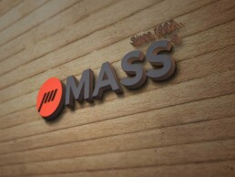
MASS
For a company that manufactures precision mass weighing scales and other measuring equipment, the logo had to be designed in a fashion that reflects reliability and a solid reputation. With the use of heavy fonts and base colors, along with thick geometric designs, this was accomplished.
SAURA UNIVERSAL SERVICES
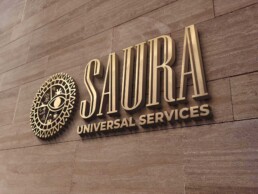
Saura provides holistic services regarding traveling, that include local guidance and experiencing the culture and heritage of a destination. The logo, hence, was designed to aptly showcase this. With various elements like natural terrain, entertainment, food, and others such. This accomplished the intent and Saura came across as a sophisticated brand.
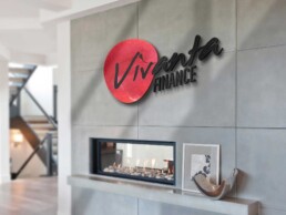
VIVANTA FINANCE
Vivanta Finance is a company that provides dynamic services to its clientele and plays the role of a catalyst in their growth. Its font and the inclined design in the logo, along with the bright crimson color, portray this. On the other hand, the typography in the word ‘FINANCE’ reflects the company’s stable, solid and reliable nature.
MOMENTS
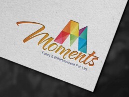
For an event management company, we conceptualised a logo that is as vibrant and colorful as life itself. This, we complemented with a pixelated texture, that reflects the joy in capturing life’s most precious ‘MOMENTS’.
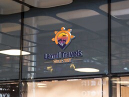
LAXMI OPERATORS
As the logo of a travel company, Laxmi Travels’ logo had to depict elements intrinsic to the sector. A sunset, an airplane, and a palm tree, all incorporated within the location icon did the trick. The deep orange further lent a feel that was inviting as well as luxurious.
PRASANG PRESIDENCY
The primary intent behind designing the logo of Prasang Presidency was to showcase regality, and to create a sense of luxury and comfort. With bold fonts and solid deep shades of reds and greys, this was accomplished. The final design also had an aura of stability and reliability, qualities that are highly valued in the hospitality industry.
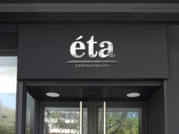
ETA CONTEMPORARY
For Eta Contemporary, a clothing boutique for contemporary and sophisticated garments, we were required to create a design that reflected these qualities. A steel black background with a minimalistic silver typography exuded these, as well as a sense of luxury that was intrinsic to the brand.
SPAREBIZ
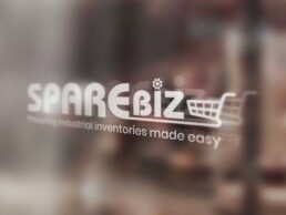
Sparebiz is an e-commerce portal that facilitates procurement of spare parts and other industrial supplies. The logo hence needed to reflect its nature, while reflecting its reliability and sophisticated stance. With a minimal design and a shopping cart illustration, this was made possible.
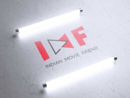
IMF – INDIAN MOVIE FRIEND
For a movie platform, we wished for something that inherently signifies motion pictures, and what else can do it justice than the play button symbol. Apart from this, we also wished to portray something that signifies ‘coming together’, which we did in the form of the solid geometrical merging of two triangles, which also represented the M in IMF.
WHITE SANDS BAY RESORT
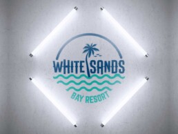
Two elements that we wished the logo of a beach resort to incorporate were ocean waves and palms, apart from a color palette that reflected a cool, breezy and laid back mood. The finished logo, which includes a sand like texture in the background, reflects all this, and instantly transports people to their happy beach place.
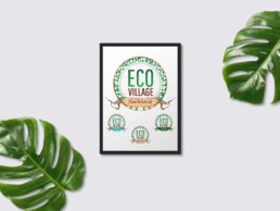
ECO VILLAGE – JHARKHAND
The logos for the three eco-villages established by Jharkhand Tourism department were designed to depict the versatile and thriving ecosystems of these sites. The logo thus portrayed roots and leaves, intertwined with the circle of life, and unabashedly flaunting hues like brown and green.
JK MOTORS
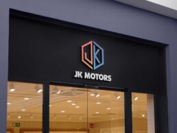
For a motor company, reliability and strength were the two primary aspects that were to be reflected in its branding. With JK Motors, we also wished the logo to reflect sophistication. The final designs accomplished this in an aesthetic, but minimalistic fashion.
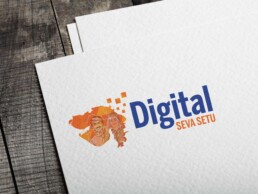
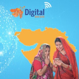
DIGITAL SEVA SETU
The logo of Digital Seva Setu had to show the merging of the digital era along with the remote rural areas, where the reach of the internet was to be pushed. The logo accomplished this with various elements that showcase the digital spectrum along with rural Gujaratis. Putting them against Gujarat’s map was what completed the theme and aptly reflected the endeavor.
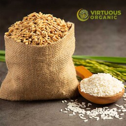
VIRTUOUS ORGANIC
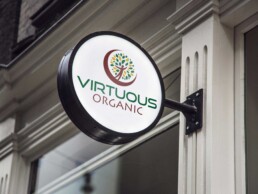
As per the name and the nature of the company, the logo of Virtuous Organic was designed to depict earthy hues like brown, green and yellow. This, combined with human caricature that reached upwards, showcased how going organic can help one move in the right direction and live better.
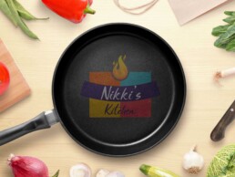
NIKKI’S KITCHEN
For Nikki’s Kitchen, we wanted to design a logo that would show the versatility of the delicacies offered by the company, along with elements that bring together different flavor palettes of our country. A frying pan with geometric designs in various colors, along with the lit fire, came together to portray all that we, as well as the client, wished.
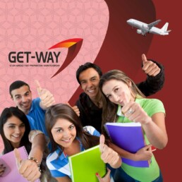
GET-WAY
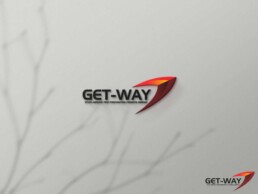
Get-way is an institution that facilitates student immigration to many sought after destinations like the US, Canada, Australia, and other such. As per the client’s preferences, the logo we designed for them was minimalistic, and showcased a geometric design that signified flying away. With rich colors like deep crimson and hues of orange and grey, we established the brand as a reliable one.
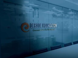
DECODE FOUNDATION
Decode Foundation was established with an aim to lend solidarity to just causes, while demonstrating flexibility and growth in its functioning. Accordingly, we tried portraying this through the spiral design, which reflects all these qualities, anda solid font and color scheme.
EXPRESSIONS
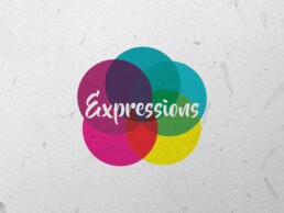
When we sat down to ideate on Expressions’ logo design, we realised that nothing can be as expressive as colors. The logo was thus conceptualised to have multiple hues, in accordance with life’s different moods and expressions.
23RD YOUTH FEST LUCKNOW
For a logo that stood for a youth fest, we conceptualized a design that was vibrant and colorful. While a rainbow color palette fit perfectly well, an overlapping geometric pattern was designed to incorporate this. The result was as stunning as it was youthful.
GLOBAL SPICE
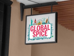
The logo design of a brand like Global Spice had to incorporate elements that not only represented the globe, but also the versatile diversity that the planet houses. The best way to accomplish this was to create a design that encompassed the seven wonders of the world, as well as a vibrant look.
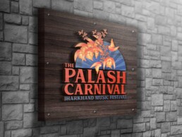
PALASH CARNIVAL
Palash was a music fest hosted in Jharkhand. As the carnival was expected to be very popular with the youth and the performing artists, it was ideated that it should portray a vibrant and colorful image. Moreover, as the event was also meant to boost tourism in Jharkhand, a local natural element – the Palash flower plant, from which the event got its name, was also incorporated in the logo.
ADF TECH EXPO
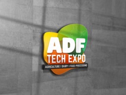
ADF stoof for Agriculture, Dairy and Fisheries. In accordance with this basic theme of the event, the logo was conceptualised to incorporate three colors, as well as design that will merge the three. The logo was also to be bright, for the event to come out as one presenting infinite opportunities to the participants.